This is an interview i conducted on Andrew giving his opinions on my first draft of my album cover and how it could be improved.
Friday, 14 December 2012
Tuesday, 27 November 2012

Tuesday, 13 November 2012
extra content for my final video
i have been watching a lot of live videos for ideas that i could use, and i have noticed that in a lot of live videos there is footage of the band setting up throughout the video and i would like to incorporate that idea in my video.
http://www.youtube.com/watch?v=un82tyFzG7I&safe=active
http://www.youtube.com/watch?v=un82tyFzG7I&safe=active
Friday, 19 October 2012
Digi pack example

Tuesday, 16 October 2012
Target audiance
The music type is only appealing to a select group of people there are many groups of people that would turn away from this kind of music so identifying the correct target audience is crucial for my video to work. My target audience will be teenagers/young adults who listen to hard rock/metal, they will tend to dress in dark clothing, or band tops. The music is unisex and the males of this group will tend to be involved in mosh pits and slam dancing, where as females will tend to be stood by the side occasionally joining in.
Friday, 12 October 2012
deconstruction of promotional flyer
 This promotional poster has used the Digi pack album cover picture; for buyers of the album or followers of the band they instantly know which band it is without having to look at the text, the promotional flyer clearly features venues and dates for the tour which if you like the band it intrigues you to look for a venue near you, and even if you have never heard of the band before it may make you want to go and listen to them.
This promotional flyer does not use an cover from an album but an original picture. if you are familiar of system of a down this picture tells you what band it is before you look at the title similar to the attack attack poster due to its style. unlike the attack attack poster this one features only one date; this makes it seem like a rare opportunity increasing the chance of people wanting to go see the band live.
This promotional flyer is similar to the attack attack poster for the live tour dates being featured, but it is also very different as it uses a lot of bright colours which draw the readers/viewers interest. the use of these bright colours and speciall effects make the band appear that good there out of this world; this is sybolised by the singer flying. in the bottom corner it features "your first chance to see pendulum live in 2010" this makes the tour seem special, something that you dont want to miss.
due to its style. unlike the attack attack poster this one features only one date; this makes it seem like a rare opportunity increasing the chance of people wanting to go see the band live.This promotional flyer is similar to the attack attack poster for the live tour dates being featured, but it is also very different as it uses a lot of bright colours which draw the readers/viewers interest. the use of these bright colours and speciall effects make the band appear that good there out of this world; this is sybolised by the singer flying. in the bottom corner it features "your first chance to see pendulum live in 2010" this makes the tour seem special, something that you dont want to miss.
Tuesday, 25 September 2012
Digi pack front cover deconstructions

The artwork instantly reveals the genre of music to the viewer through the use of the Gothic elements e.g the grim reaper flying through the fog, also there are vines/plants growing around the girl appear to be covering her all of these reveal to the audience that this album genre is heavy rock/metal also these images help draw the audience in they may want to know what happens to the girl in the drawing.
The style of the text matches the drawing it is very artistic also where certain parts of letters are missing it makes the text appear more Gothic. the colour choice of the text helps the texts stand out from the rest of the Digi pack cover, the word Nightmare is coloured blood red which ties in with the Gothic genre.
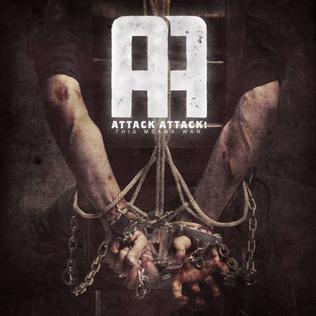
Attack Attack album cover; This digi pack cover is a real photo and shows a heavily chained man tied to a chair; this gives the impression of a highly dangerous character or war prisoner as well as this the use of the majority of the picture being black this makes the character seem isolated; all of these show that the genre is heavy rock/metal but it also hints that there is a story behind this album.
The style of text is similar to those in superhero posters/films which makes the audience consider whether the man in the chair is innocent instead of being a villain.

Adept album cover; This Digi pack cover shows a contrast between the city on fire and the grassy hills; the town is in darkness but the hills are covered in light this could be interpreted as a visual metaphor for heaven and hell. The type of font used makes the text look old and Gothic, but the fact its in white contrasts with this view, possibly hinting that this band is going to save the city from hell.
Friday, 21 September 2012
Digi pack ideas

i have just recently purchased this Venetian styled mask and i am looking at including this as the key focus point of my digi pack cover, i will keep the mask in colour but have everything else in black and white.
Friday, 14 September 2012
A2 media coursework ideas
For my A2 media coursework i will be creating a promotional package for the local band Catharsis, complete with a digi pack, promotional video, and a flyer.

Digpack ideas;
A artistic drawing e.g
I would create a simple drawing, with elements of the gothic throughout such as dark colours, gothic locations or creatures.

A contrast between artistic and real e.g
i would use a gothic location with a key focus point on something in the vicinity and then add a drawing on top to give a more gothic feel.
A image e.g
for this i would use a area with low light, maybe darkness with a key object
For the flyer i will use a similar style of artwork with live tour dates.
For the promotional video i will be recording at a live show, with scenes focused on the band and the crowd. e.g http://www.youtube.com/watch?v=iSf_cs4-E-I&safe=active
these are two examples of what i would like to create.
Subscribe to:
Posts (Atom)